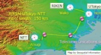
1. Larger Arrows: Arrows used to indicate movement on a motion map are often scaled to represent the velocity of the moving object. Longer or larger arrows indicate higher velocity, while shorter arrows represent lower velocity.
2. Arrowhead Density: The density of arrowheads can indicate velocity. Maps that show frequent and closely spaced arrowheads usually represent higher velocity compared to maps with sparse arrowheads.
3. Color Coding: Different colors can be used to represent different velocity ranges. Warmer colors like red and orange usually denote higher velocities, while cooler colors like blue and green represent slower velocities.
4. Line Thickness: The thickness of the arrows or lines representing movement can also indicate velocity. Thicker lines often represent higher velocity, while thinner lines indicate lower velocity.
5. Shading or Contour Lines: If a motion map shows a velocity field (a vector field of velocities at different points in space), shading or contour lines can be used to represent variations in velocity. Darker shading or closer-spaced contour lines usually indicate regions of higher velocity.
By using a combination of these elements, a motion map can effectively communicate variations in velocity and provide insights into the movement patterns and dynamics of the represented system.