One type of bias that can occur is sampling bias. This occurs when the data is not collected in a way that represents the entire population of interest. For example, if a mapping project relies on data collected by volunteers, it is likely that the data will be skewed towards areas that are easily accessible or popular with volunteers. This can lead to maps that are inaccurate or misleading.
Another type of bias that can occur is selection bias. This occurs when the data is not collected in a way that ensures that all members of the population of interest have an equal chance of being included. For example, if a mapping project relies on data collected by volunteers who are all members of a particular group, it is likely that the data will be biased towards that group. This can lead to maps that are not representative of the entire population.
Finally, there is also the potential for observer bias. This occurs when the people collecting the data are influenced by their own beliefs or expectations. For example, if a volunteer is collecting data on the distribution of a particular species, they may be more likely to record sightings of that species in areas where they expect it to be found. This can lead to maps that are inaccurate or misleading.
It is important to be aware of the potential biases that can arise when using citizen science data for mapping, and to take steps to minimize these biases. One way to do this is to use a stratified sampling design, which ensures that all members of the population of interest have an equal chance of being included in the data. Another way to minimize bias is to use a double-blind study design, in which the people collecting the data are not aware of the purpose of the study.
By taking these steps, it is possible to use citizen science data to create accurate and reliable maps that can be used to inform decision-making and improve our understanding of the world around us.
Here are some specific examples of how bias can show up in maps made with citizen science data:
* A map of the distribution of a particular species might be biased towards areas that are easily accessible to volunteers, or towards areas where the species is known to be present. This could lead to the false impression that the species is more widespread than it actually is.
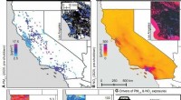
* A map of the quality of air or water might be biased towards areas where people live or work, or towards areas where there are known pollution sources. This could lead to the false impression that the air or water quality is worse in these areas than it actually is.
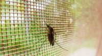
* A map of the distribution of a particular disease might be biased towards areas where there are more hospitals or clinics, or towards areas where people are more likely to seek medical care. This could lead to the false impression that the disease is more prevalent in these areas than it actually is.
It is important to be aware of the potential biases that can arise when using citizen science data for mapping, and to take steps to minimize these biases. By doing so, it is possible to create accurate and reliable maps that can be used to inform decision-making and improve our understanding of the world around us.