Split-complementary color schemes are often used in interior design and fashion because they create a sense of harmony and balance while still providing visual interest. They can also be used to create a variety of different moods and atmospheres. For example, a split-complementary color scheme using cool colors can create a calming and relaxing effect, while a split-complementary color scheme using warm colors can create a more energetic and vibrant atmosphere.
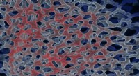
Here is an example of a split-complementary color scheme:
* Base color: Blue
* Split complementary colors: Orange-red and yellow-green
* Accent color: Purple
This color scheme would create a sense of harmony and balance while still providing visual interest. The blue and orange-red colors would provide a strong contrast, while the yellow-green and purple colors would provide a sense of balance. This color scheme could be used to create a variety of different moods and atmospheres, depending on the specific shades of blue, orange-red, yellow-green, and purple that are used.