By Cara Batema Updated Aug 30, 2022
Ableimages/Photodisc/Getty Images
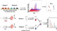
When you examine a textbook or a professional scientific report, you’ll notice that images and charts are woven throughout the text. These visual elements are designed to capture attention—and often convey information more effectively than dense prose. In a science‑fair report, well‑crafted charts not only enhance your board but also help your audience quickly grasp complex data.
The first step in building a chart is to gather and organize your data. Reflect on the results you anticipated versus the surprising findings that emerged. Summarize the key discoveries in a few sentences—these insights will become the heart of your most compelling charts. Avoid cluttering your board with a chart for every raw data point; instead, highlight the most intriguing trends or calculations. For instance, if you surveyed students about their favorite foods, you could present the results as percentages in a chart.
Selecting an appropriate chart depends on the nature of your information. Pie charts excel at illustrating percentages or the composition of a whole. Line graphs reveal trends over time, such as plant growth measured over a week. Bar charts compare discrete categories—like modes of transportation to school—using vertical or horizontal bars. Pictograms resemble tally charts and can display counts visually. Tables organize raw numbers, while scatter diagrams explore relationships between two variables, such as math versus English test scores.
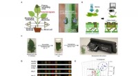
When you create your chart, consider the variables. In an experiment, the independent variable is the factor you deliberately change (e.g., the amount of water a plant receives). The dependent variable is the outcome you measure (e.g., plant height). Place the independent variable on the x‑axis (horizontal) and the dependent variable on the y‑axis (vertical). For example, a line graph showing how water volume affects plant growth would have water volume on the x‑axis and plant height on the y‑axis. Scatter plots assign one variable to each axis—math scores on the x‑axis, English scores on the y‑axis, for instance.
Finalize your chart with a concise title and clear labels. Even if the visual is striking, your audience must understand what they’re seeing. Place the chart’s title beneath the graphic and keep it brief yet informative—for example, “Plant Growth Across Varying Water Levels.” Provide a short explanatory sentence that summarizes the chart’s key takeaway. Always label both axes with the corresponding variable. For pie charts, include a legend or key that identifies each slice and its percentage. A well‑labeled chart not only looks professional but also builds trust with your audience.